How to create a chart
Author: Linus Sander
In the following guide, we will create a ContinuousChart together.
We will address the required structure of the data, and build a simple ContinuousChart component, and then gradually customizing it to fit our needs.
Building a CategoricalChart instead of a ContinuousChart works in almost the same way,
except that a few parameters are missing, and the component expects the data in the CategoricalChartData format.
For more details, an overview of the individual parameters, structures, and functions, please refer to chapter Charts.
Let's start with the data
First, we create very simple dummy raw data object to ensure our chart has data to display later on.
To make the ContinuousChart component interpret the data correctly, we need to define it in the ContinuousChartData format.
This format is explained in detail in the general 'Charts' documentation.
We start by setting the necessary general values that need to be filled.
The type is set to ContinuousChartDataType.LINE_CHART_DATA for every instance of ContinuousChartData,
and the xAxisType is set to 'linear' because our x-axis will follow a standard linear progression.
Further, we add a title to the y-axis by defining yAxisLabel.
The data series to be plotted in the chart are stored in the lines array. Here, we add our first simple dummy data series.
This requires at least a name and an array called dataPoints, which contains an array of x and y values.
const dummyChartData: ContinuousChartData = {
    type: ContinuousChartDataType.LINE_CHART_DATA,
    xAxisType: 'linear',
    yAxisLabel: 'Mill',
    lines: [
        {
            name: 'Category A',
            dataPoints: [
                { x: 0, y: 4 },
                { x: 1, y: 3 },
                { x: 2, y: 4 },
                { x: 3, y: 8 },
            ],
        },
    ],
};
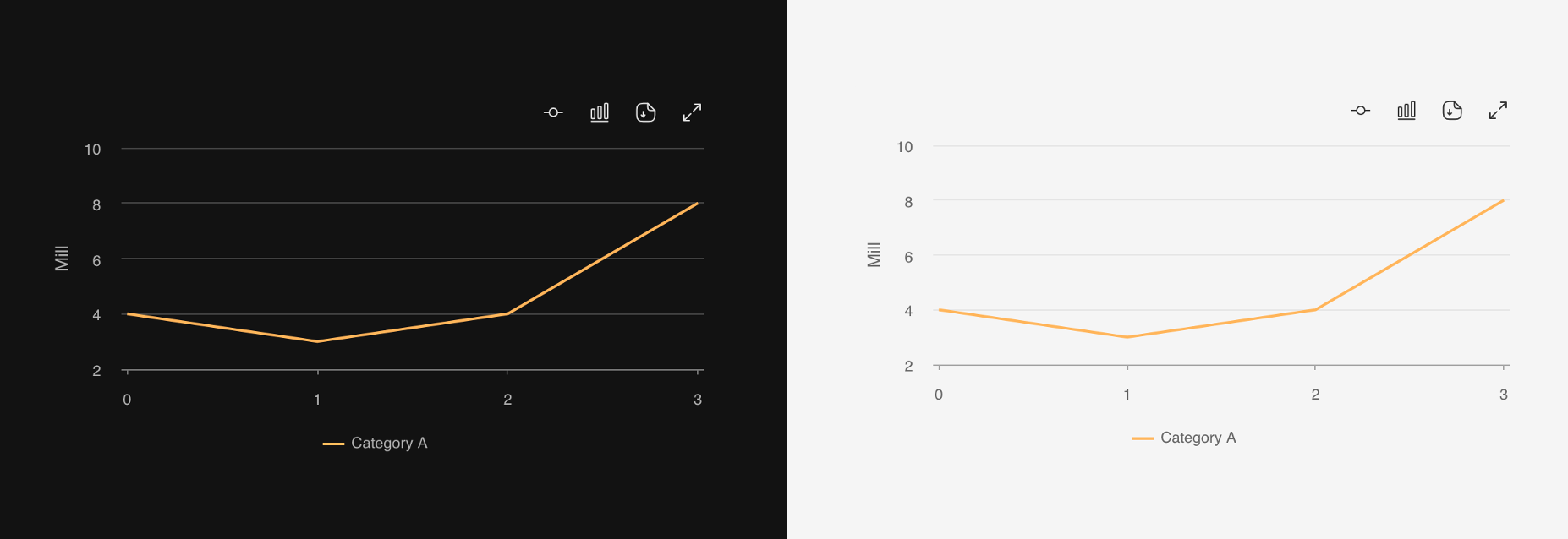
A simple chart component that plots our data
To plot our data, we create a ContinuousChart component.
This component automatically adjusts to the width of its parent, which is why we wrap it in a div with a fixed width.
Using the data parameter, we can pass the previously created data object, and the data will be plotted in our ContinuousChart component.
<div className="w-500px h-fit">
    <ContinuousChart
        data={dummyChartData}
    />
</div>
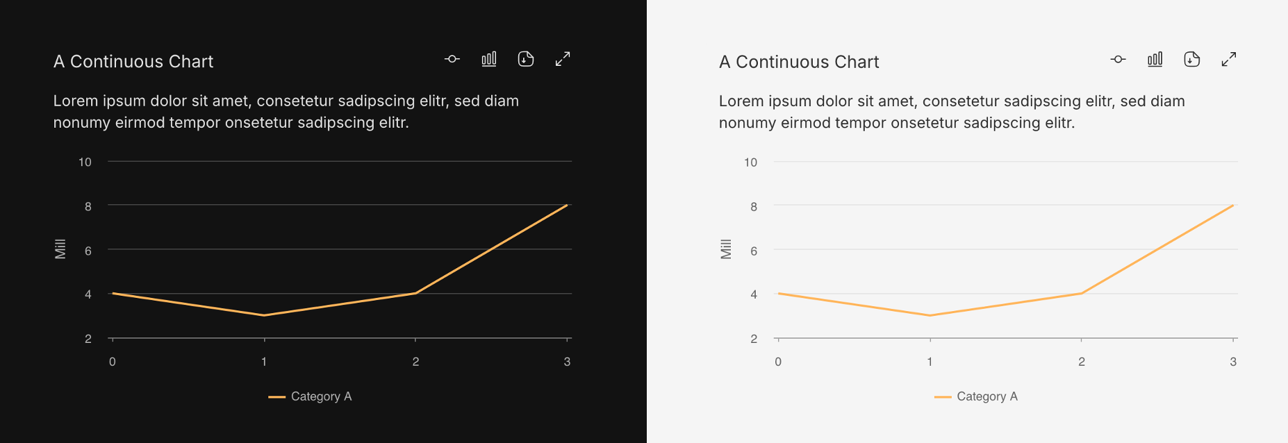
Let's add more information to the chart box
The ContinuousChart component also allows us to add a title and a description
and of course it automatically adjusts its height to display the text, but the height of the chart itself remains fixed.
(More about the various available parameters)
...
    <ContinuousChart
        ...
        title="A Continuous Chart"
        description="Lorem ipsum dolor sit amet, consetetur sadipscing elitr, sed diam nonumy eirmod tempor onsetetur sadipscing elitr."
    />
...
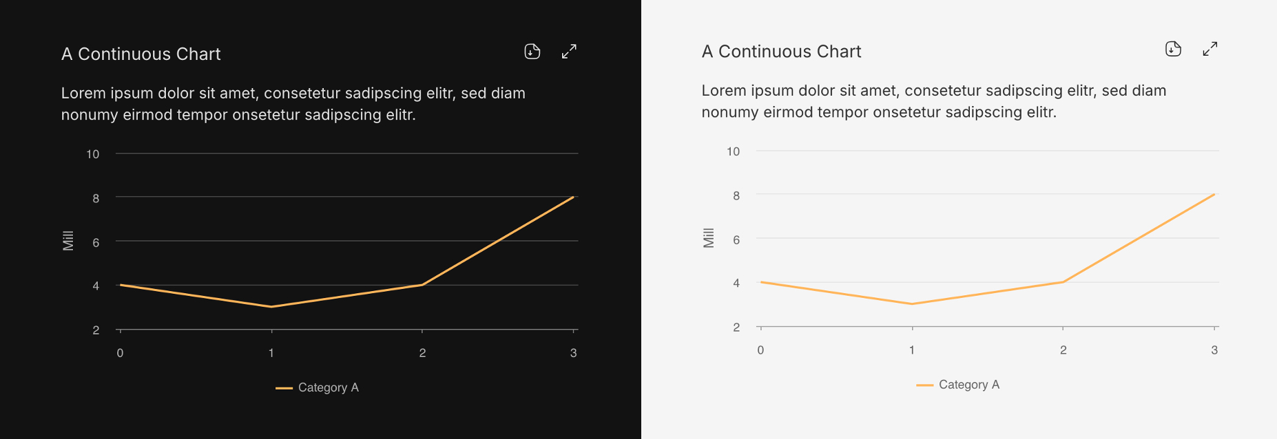
Deactivate functionalities we do not need
The ContinuousChart component comes with several additional functionalities, all of which are enabled by default.
For an overview of these functionalities, refer to Charts.
Each of these functionalities can be disabled by adding the appropriate 'disable' keyword to the ContinuousChart component.
In this case, we want to disable the slider functionality and the switch-chart-type functionality, so we add the keywords disableXAxisSlider and disableBarChartSwitch.
The buttons for these functionalities a not shown anymore:
...
    <ContinuousChart
        ...
        disableXAxisSlider
        disableBarChartSwitch
    />
...
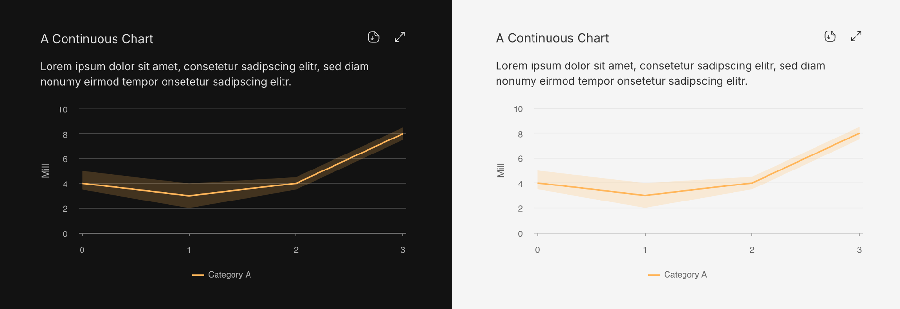
Adding an area to our dummy series
Now back to the data of the chart itself, as there are some additional functionalities to explore.
For example, to display a range around our data series line, we can add yRangeMin and yRangeMax values to each data point (x and y values).
If we then set the showRange parameter of the line to true, the specified range will be automatically displayed in our chart.
const dummyChartData: ContinuousChartData = {
    ...
    lines: [
        {
            ...
            dataPoints: [
                { x: 0, y: 4, yRangeMin: 3.5, yRangeMax: 5 },
                { x: 1, y: 3, yRangeMin: 2, yRangeMax: 4 },
                { x: 2, y: 4, yRangeMin: 3.5, yRangeMax: 4.5 },
                { x: 3, y: 8, yRangeMin: 7.5, yRangeMax: 8.5 },
            ],
            showRange: true
        },
    ],
};
The ability to display 'predictions' in a standardized way
Since many charts include predictions, a standardized method has been implemented to add prediction series to the data. This ensures that the design of charts including predictions remains consistent.
To add a predictions data series, the following steps are necessary:
First, we add the predictionVerticalLineX parameter so that the chart knows where the 'future' begins.
This allows the chart to insert a dividing line and mark the right side, the 'future', as such.
Second, we add another data series (a new entry in the lines array).
This time, it is important to set the prediction parameter to true so that the component recognizes it as the 'predictions' series.
Multiple predictions series can be included in a single chart, but each must be marked with prediction: true.
const dummyChartData: ContinuousChartData = {
    ...
    predictionVerticalLineX: 3,
    ...
    lines: [
        ...
        {
        name: 'Prediction',
        prediction: true,
        dataPoints: [
          { x: 0, y: 4 },
          { x: 1, y: 7 },
          { x: 2, y: 5 },
          { x: 3, y: 7 },
          { x: 4, y: 8 },
          { x: 5, y: 5 },
          { x: 6, y: 6 },
        ],
      },
    ],
};
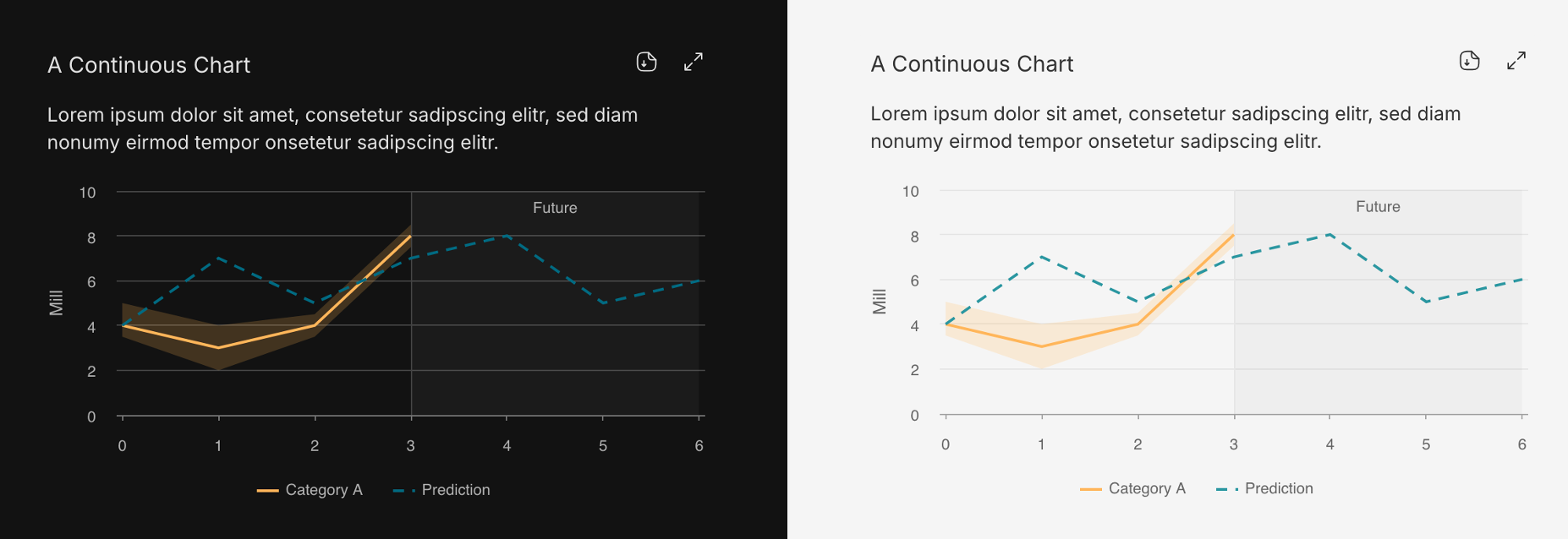
Our final chart
Here is the final data object and chart component summarized. Note, there are additional functionalities, which are described in detail in Charts.
data:
const dummyChartData: ContinuousChartData = {
    type: ContinuousChartDataType.LINE_CHART_DATA,
    xAxisType: 'linear',
    yAxisLabel: 'Mill',
    predictionVerticalLineX: 3,
    lines: [
      {
        name: 'Category A',
        showRange: true,
        dataPoints: [
          { x: 0, y: 4, yRangeMin: 3.5, yRangeMax: 5 },
          { x: 1, y: 3, yRangeMin: 2, yRangeMax: 4 },
          { x: 2, y: 4, yRangeMin: 3.5, yRangeMax: 4.5 },
          { x: 3, y: 8, yRangeMin: 7.5, yRangeMax: 8.5 },
        ],
      },
      {
        name: 'Prediction',
        prediction: true,
        dataPoints: [
          { x: 0, y: 4 },
          { x: 1, y: 7 },
          { x: 2, y: 5 },
          { x: 3, y: 7 },
          { x: 4, y: 8 },
          { x: 5, y: 5 },
          { x: 6, y: 6 },
        ],
      },
    ],
};
component:
<div className="w-500px h-fit">
    <ContinuousChart
        title="A Continuous Chart"
        description="Lorem ipsum dolor sit amet, consetetur sadipscing elitr, sed diam nonumy eirmod tempor onsetetur sadipscing elitr."
        data={maxedOutContinuousChartData}
    />
</div>

<img src="/img/charts/charts_how_to_create_a_chart_step_5.png" alt="CategoricalChart example" />