Charts
Author: Linus Sander
Overview
Two reusable components were created to enable the visualization of charts.
For continuous data the ContinuousChart component and for categorical data the CategoricalChart should be used.
Both provide various practical customization options, which will be explained in detail in the following sections.
Note: there is also a 'How to Charts' guide that explains step by step how to easily set up a
ContinuousChartcomponent.
The components are basically boxes that render a title, description, and chart.
They have a width of 100%, so they adjust to the width of their parent element in which they are used.
The height of the boxes depend on the provided text, while the chart itself has a fixed height (adjustable with the chartHeight parameter).
For the chart itself, the widely used Highcharts framework was utilized.
This framework makes it easy to represent charts of any complexity.
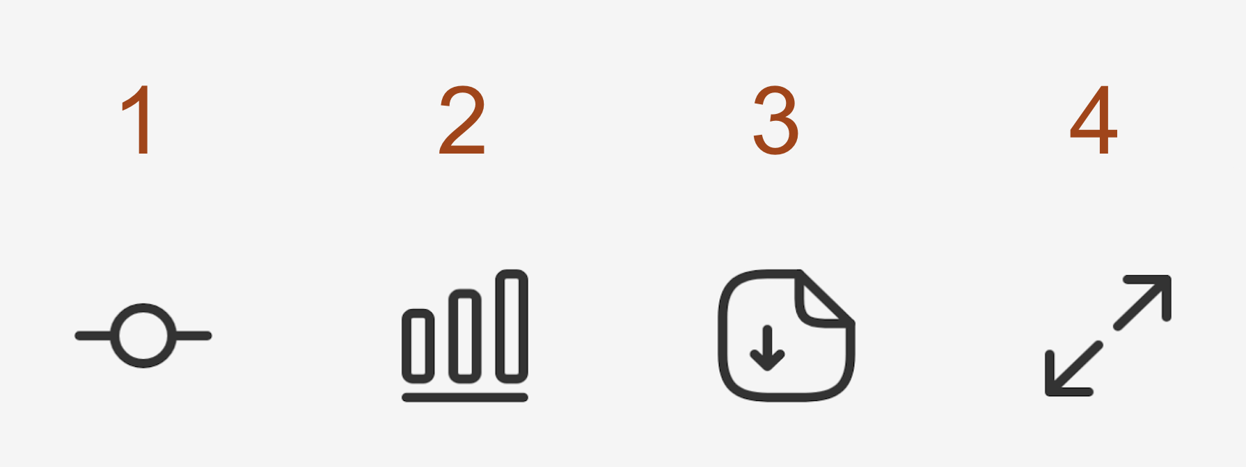
- Functionality to reveal a slider, that allows the displayed x-axis to be adjusted. This feature is only available for the
ContinuousChart. - It is possible to change the chart type. By default, a line chart is displayed in the
ContinuousChart, but with a button press, one can switch to a bar chart. In theCategoricalChartthe default bar chart can be changed to a donut (pie) chart. - Button to download the raw data behind the chart (csv, json) as well as the chart itself (png, svg).
- Option to open the chart in a full-screen modal.
Parameters
The following section provides a detailed explanation of the individual parameters for the two chart components.
For more information on the structure of the expected data object by params.data, please refer to the 'Data' section below.
ContinuousChart Parameters
dataContinuousChartData: the actual data to be used in the charttitlestring: chart title (optional)descriptionstring: chart description text (optional)smallboolean: when selected, all components in the main box become slightly smaller (optional)noPaddingboolean: when selected, the main box has no padding on all sides (optional)transparentBackgroundboolean: when selected, the background of the entire component is transparent (optional)chartHeightnumber: with this parameter, the height of the actual chart can be set to a fixed value in pixels. If chartHeight is not specified, the chart is given a fixed default height depending onsmall.disableExpandableboolean: when selected, the functionality to open the chart in a larger modal is disabled (optional)disableBarChartSwitchboolean: when selected, the functionality to switch to a bar chart is disabled (optional)disableXAxisSliderboolean: when selected, the functionality to change the x-axis range via a slider is disabled (optional)disableDownloadboolean: when selected, the functionality to download the chart is disabled (optional)simplifyTooltipboolean: when selected, the labels of the categories are not shown in the chart's tooltip (optional)
CategoricalChart Parameters
dataCategoricalChartData: the actual data to be used in the charttitlestring: chart title (optional)descriptionstring: chart description text (optional)smallboolean: when selected, all components in the line chart box become slightly smaller (optional)noPaddingboolean: when selected, the main box has no padding on all sides (optional)transparentBackgroundboolean: when selected, the background of the entire component is transparent (optional)chartHeightnumber: with this parameter, the height of the actual chart can be set to a fixed value in pixels. If chartHeight is not specified, the chart is given a fixed default height depending onsmall.disableExpandableboolean: when selected, the functionality to open the chart in a larger modal is disabled (optional)disablePieChartSwitchboolean: when selected, the functionality to switch to a pie chart is disabled (optional)disableDownloadboolean: when selected, the functionality to download the chart is disabled (optional)disableSortingboolean: when selected, sorting button is hidden in the chart full size modal (optional)
Data
This section provides a detailed description of the data expected by each of the two components for their respective params.data parameter.
ContinuousChartData
The ContinuousChart component expects a data object of type CategoricalChartData. In this object, the type
parameter is set to ContinuousChartDataType.LINE_CHART_DATA to inform the chart component that it is dealing with
LINE_CHART_DATA. Additionally, the xAxisType parameter specifies the exact type of the x-axis. For more information
about the available x-axis types, see official highcharts documentation.
The optional yAxisLabel parameter can be used to set the title of the y-axis.
The actual data is stored in lines, which contains an array where each entry represents a data series ('line') in the chart.
Each lines element must have a name and an array called dataPoints, which includes all data points of this data series.
For each individual data point, an x value must be specified, and a y value can be optionally provided.
If a range around an individual data point should also be displayed in the chart,
this can be defined using yRangeMin and yRangeMax for each individual data point.
To display the range, showRange must be set to true; only then the specified values for yRangeMin and yRangeMax will be rendered.
Additionally, the color for each data series ('line') can be explicitly set, and a specific dash style can be selected using dashStyle,
if desired (available dash styles).
In addition to all the previously described settings for the chart setup itself and the individual data series,
the parameters verticalLines and verticalBands can be used to add vertical dividing lines or color-filled areas to the graph.
A vertical line requires an x-value specifying where it should be displayed, and optionally a color or dashStyle
(available dash styles) can also be defined.
For each vertical band, xStart and xEnd must be specified to define where the area begins and ends.
Additionally, a specific color can be optionally chosen using color, and a label for the band can be declared using label.
Furthermore, it is also possible to label data series in the chart as 'predictions' to ensure consistent styling for all charts that contain predictions data.
To display a predictions data series, the following two parameters need to be configured:
First, the predictionVerticalLineX parameter must define the x-value where the 'future' begins.
Second, the prediction value must be set to true for the predictions data series, so the component recognizes it as the 'predictions' series.
Multiple predictions series can exist in a single chart, but each must be marked with prediction: true.
Note: there is also a 'How to Charts' guide that explains step by step how to easily set up a
ContinuousChartcomponent.
export interface ContinuousChartDataPoint {
  x: number;
  y?: number;
  yRangeMin?: number;
  yRangeMax?: number;
}

export interface ChartVerticalLine {
  x: number;
  color?: string;
  dashStyle?: DashStyleValue;
}

export interface ChartVerticalBand {
  xStart: number;
  xEnd: number;
  color?: string;
  label?: string;
}

export interface ContinuousChartData {
  type: ContinuousChartDataType.LINE_CHART_DATA;
  xAxisType: AxisTypeValue;
  yAxisLabel?: string;
  predictionVerticalLineX?: number;
  lines: {
    name: string;
    dataPoints: ContinuousChartDataPoint[];
    showRange?: boolean;
    color?: string;
    dashStyle?: DashStyleValue;
    prediction?: boolean;
  }[];
  verticalLines?: ChartVerticalLine[];
  verticalBands?: ChartVerticalBand[];
}
CategoricalChartData
The CategoricalChart component expects a data object of type CategoricalChartData.
In this object, the title of the y-axis label can be defined using yAxisLabel (optional),
along with an arbitrarily long categories array where each entry corresponds to a category.
A category consists of a name, a dataPoint containing only the actual data point (y), and an optional color attribute.
If a range around an individual data point should also be displayed in the chart, this can be defined using yRangeMin
and yRangeMax for each individual data point. The range whiskers are only shown in the bar chart, not in the pie chart,
and only if both, yRangeMin and yRangeMax, are defined.
With the help of yRelative, it is possible to specify also relative numbers.
If at least one category has a yRelative defined, the chart provides a button that allows the user to switch to the relative numbers.
When the user switches to relative numbers, only the bar chart is displayed, and switching back to a pie chart is no longer possible.
Additionally, yRangeMinRelative and yRangeMaxRelative can be used to define an error range for the relative numbers.
export interface CategoricalChartData {
  yAxisLabel?: string;
  categories: {
    name: string;
    dataPoint: {
      y: number;
      yRangeMin?: number;
      yRangeMax?: number;

      yRelative?: number;
      yRangeMinRelative?: number;
      yRangeMaxRelative?: number;
    };
    color?: string;
  }[];
}
Examples
Note: there is also a 'How to Charts' guide that explains step by step how to easily set up a
ContinuousChartcomponent.
ContinuousChart examples
Simple example
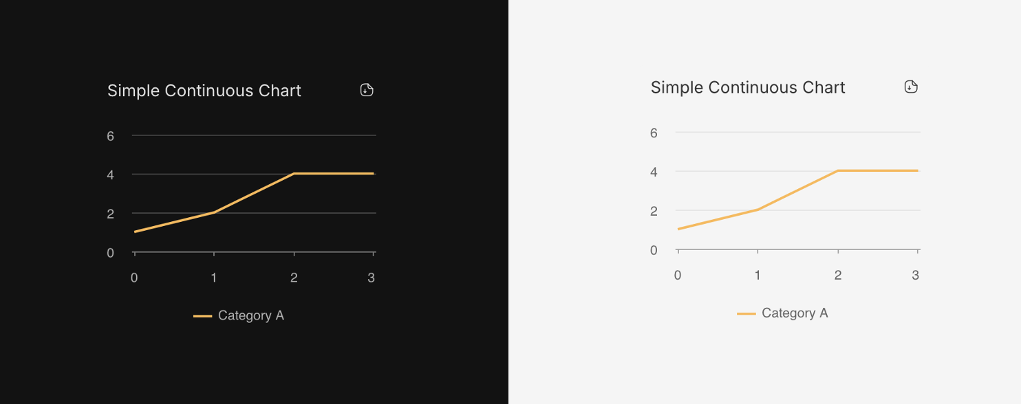
data:
const dummyChartData: ContinuousChartData = {
    type: ContinuousChartDataType.LINE_CHART_DATA,
    xAxisType: 'linear',
    lines: [
      {
        name: 'Category A',
        dataPoints: [
          { x: 0, y: 1 },
          { x: 1, y: 2 },
          { x: 2, y: 4 },
          { x: 3, y: 4 },
        ],
      },
    ],
};
component:
<div className="w-250px h-fit">
    <ContinuousChart
        title="Simple Continuous Chart"
        data={dummyChartData}
        small
        disableBarChartSwitch
        disableExpandable
        disableXAxisSlider
    />
</div>
Maxed out example
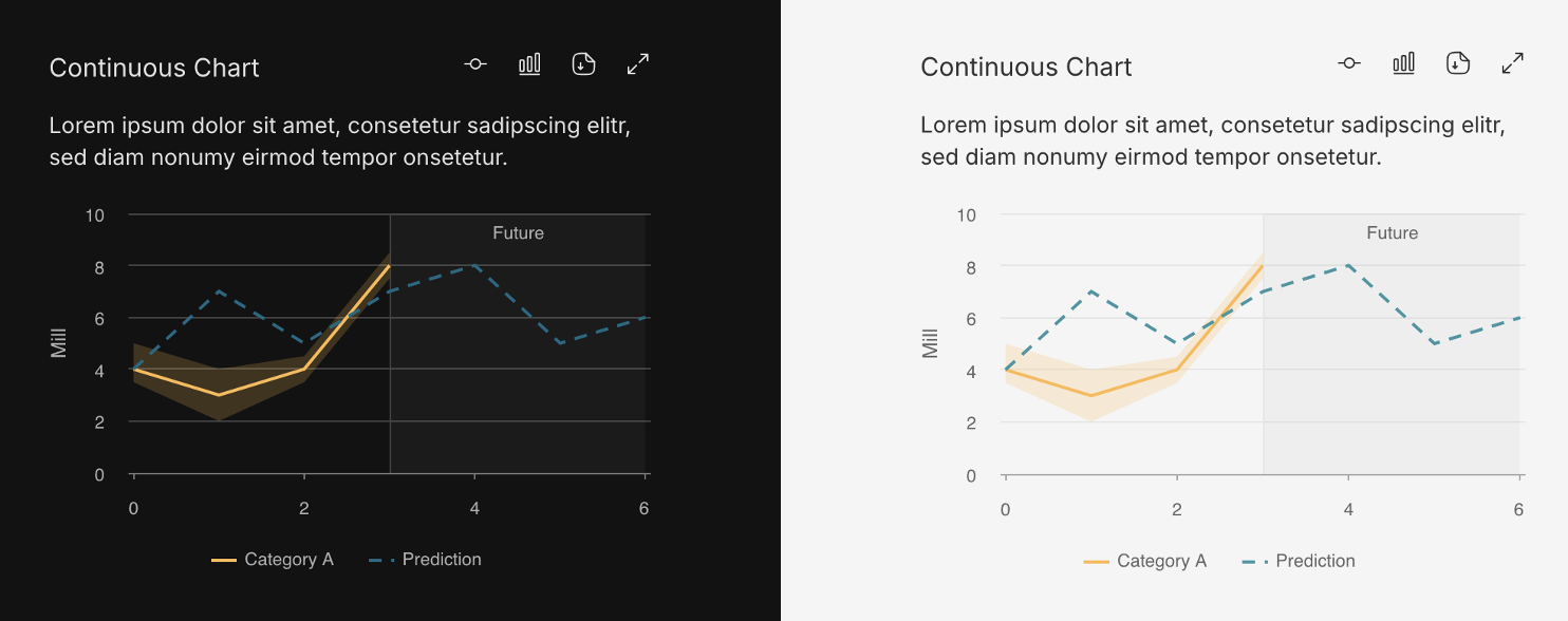
data:
const dummyChartData: ContinuousChartData = {
    type: ContinuousChartDataType.LINE_CHART_DATA,
    xAxisType: 'linear',
    yAxisLabel: 'Mill',
    predictionVerticalLineX: 3,
    lines: [
      {
        name: 'Category A',
        showRange: true,
        dataPoints: [
          { x: 0, y: 4, yRangeMin: 3.5, yRangeMax: 5 },
          { x: 1, y: 3, yRangeMin: 2, yRangeMax: 4 },
          { x: 2, y: 4, yRangeMin: 3.5, yRangeMax: 4.5 },
          { x: 3, y: 8, yRangeMin: 7.5, yRangeMax: 8.5 },
        ],
      },
      {
        name: 'Prediction',
        prediction: true,
        dataPoints: [
          { x: 0, y: 4 },
          { x: 1, y: 7 },
          { x: 2, y: 5 },
          { x: 3, y: 7 },
          { x: 4, y: 8 },
          { x: 5, y: 5 },
          { x: 6, y: 6 },
        ],
      },
    ],
};
component:
<div className="w-400px h-fit">
    <ContinuousChart
        title="Maxed Out Continuous Chart"
        description="Lorem ipsum dolor sit amet, consetetur sadipscing elitr, sed diam nonumy eirmod tempor onsetetur sadipscing elitr."
        data={maxedOutContinuousChartData}
    />
</div>
CategoricalChart example
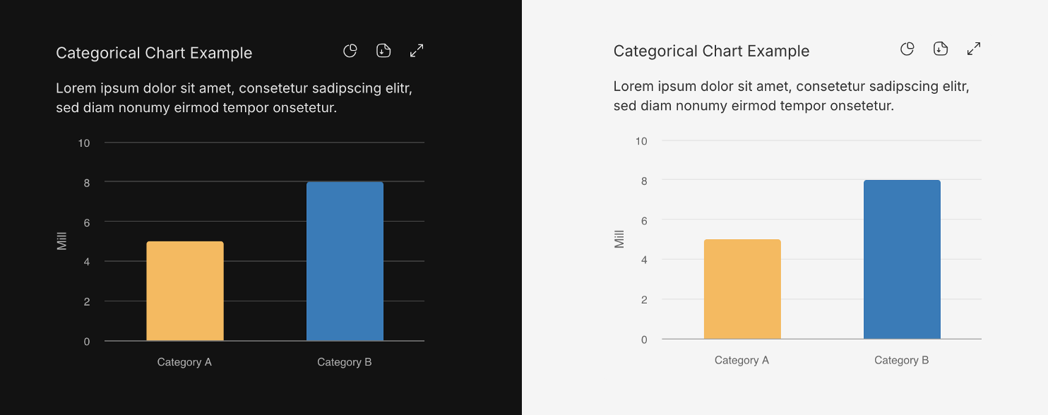
data:
const dummyChartData: CategoricalChartData = {
    yAxisLabel: 'Mill',
    categories: [
      {
        name: 'Category A',
        dataPoint: { y: 5 },
      },
      {
        name: 'Category B',
        dataPoint: { y: 8 },
      },
    ],
};
component:
<div className="w-400px h-fit">
    <CategoricalChart
        title="Categorical Chart Example"
        description="Lorem ipsum dolor sit amet, consetetur sadipscing elitr, sed diam nonumy eirmod tempor onsetetur."
        data={dummyChartData}
    />
</div>