Food Consumption map
Author: Armanpreet Ghotra
FCS or Food Consumption Score map visualize FCS data. In addition to the map, custom components such as accordions, tooltips, and legends are included.
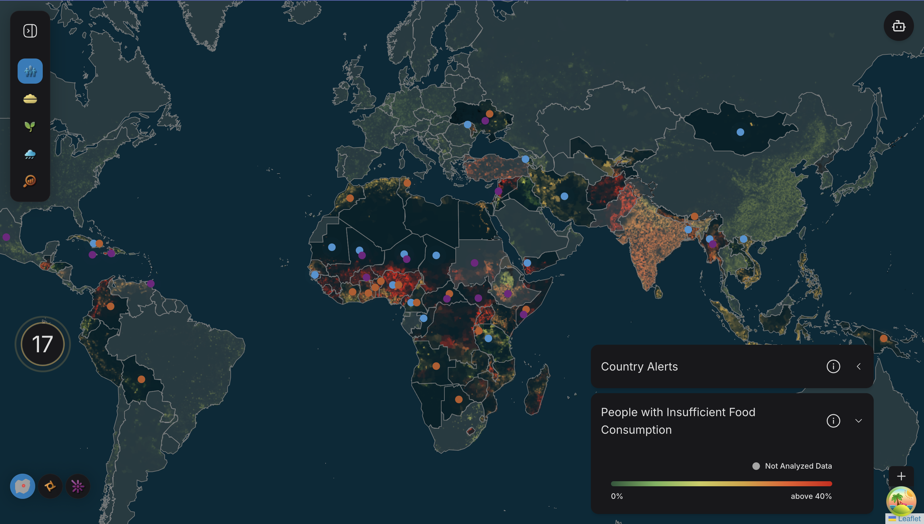
World View
In world view, FCS map appears with country alert's. Along with alerts, one point legend and other gradient legend appears. To enhance user experience, hover effect is also activated.
Technical Overview
The code below in Map.ts helps to trigger the FCS map. For each country FcsChoropleth get rendered. The props need by FcsChoropleth:
key: A unique key derived from the country's adm0_id property.data: The geoJSON data for the specific country.fcsData: The food security data for rendering.setRegionLabelTooltips: A function to set tooltips for region labels.onDataUnavailable: A callback to handle missing data.
  <FcsChoropleth
    key={country.properties.adm0_id}
    countryId={country.properties.adm0_id}
    data={{ type: 'FeatureCollection', features: [country as Feature<Geometry, CountryProps>] }}
    fcsData={fcsData}
    setRegionLabelTooltips={setRegionLabelTooltips}
    onDataUnavailable={onDataUnavailable}
    />
If no selectedCountryId is specified then a TileLayer is added inside a Pane component with zIndex: 2.
 <Pane name="fcs_raster" style={{ zIndex: 2 }}>
    <TileLayer url="https://static.hungermapdata.org/proteus_tiles/{z}/{x}/{y}.png" tms />
</Pane>
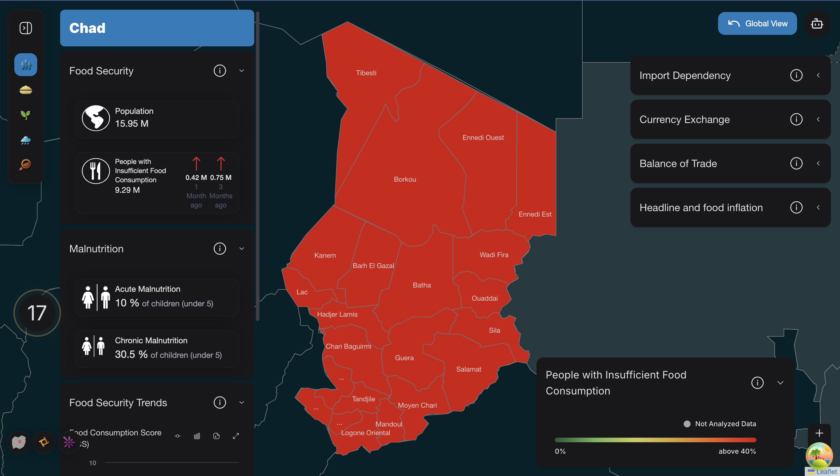
Country View
Apart from that, customized accordions, legend, loading state and hover effect appears.
Technical Overview
In FcsCountryChoropth.tsx, the FCS map for the country view get rendered. It returns
This <GeoJSON> component renders GeoJSON data (regionData) on a map. It applies custom styling through FcsCountryChoroplethOperations.styleFunction and defines interactive behavior for each map feature using FcsCountryChoroplethOperations.onEachFeature.
 <GeoJSON
     data={regionData as FeatureCollection}
     style={FcsCountryChoroplethOperations.styleFunction}
     onEachFeature={(feature, layer) =>
       FcsCountryChoroplethOperations.onEachFeature(feature, layer, regionData as FeatureCollection)
     }
   />
Main props need by FcsCountryChoropleth are:
countryMapDatasetRegionLabelTooltipsonDataUnavailable
Before the Country view appear, in order enhance the experience while fetching the data, the loading state for the view is activated via :
<CountryLoadingLayer countryMapData={countryMapData} color="hsl(var(--nextui-fcsAnimation))" />
The Map interactivity has been increase by applying hover effect
Three accordions appear on the left side and four accordions appear on the right side. The accordions which appear on the left side, are opened per default. If the user clicks on a country, the accordions get called as follows:
   <FcsAccordion
        countryCode={countryData.iso3}
        countryId={countryData.adm0_id}
        countryName={countryData.adm0_name}
    />
In FcsAccordion.tsx, the fcsAccordion functions depending upon whether it's mobile or desktop version, accordion content packed inside <AccordionContainer>. Main props needed by fcsAccordion are:
countryNamecountryIdcountryCode
In order to extract the content of the accordions, first country data and country iso3 data get extracted using useCountryDataQuery(countryId)and useCountryIso3DataQuery(countryCode). After that the data got processed in FcsFoodSecurityOperations.tsxand FcsMacroEconomicOperations.tsx. The following accordions are shown in the view:
Food Security AccordionMalnutritionFood Security TrendsImport DependencyCurrreny ExchangeBalance of TradeHead and Food Inflation
If there is no data available, then the content would be No Data availablefor the particular accordion.
With the help of the scrollbar on the left side, user can see the last accordion.
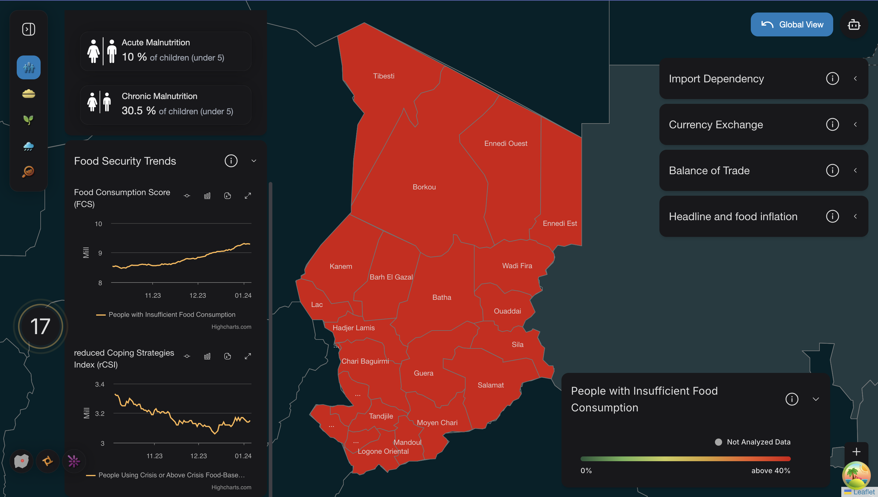
Customized tooltip has been implemented in FcsRegionTooltip.tsx. FcsRegionTooltip component, which renders a tooltip displaying detailed information about a region in an FCS map. The component receives GeoJSON feature data as a prop and extracts relevant properties, such as population data for insufficient food consumption (FCS) and food-based coping, formatting them for display.
The tooltip includes:
- The region's name.
- Percentages and populations (in millions) for insufficient food consumption and food-based coping, or messages indicating missing data.
- A continuous chart showing trends in insufficient food consumption if graph data (FCSGraph) is available. The component uses dynamic styling and displays data interactively, enhancing the map's visualization with contextual insights.
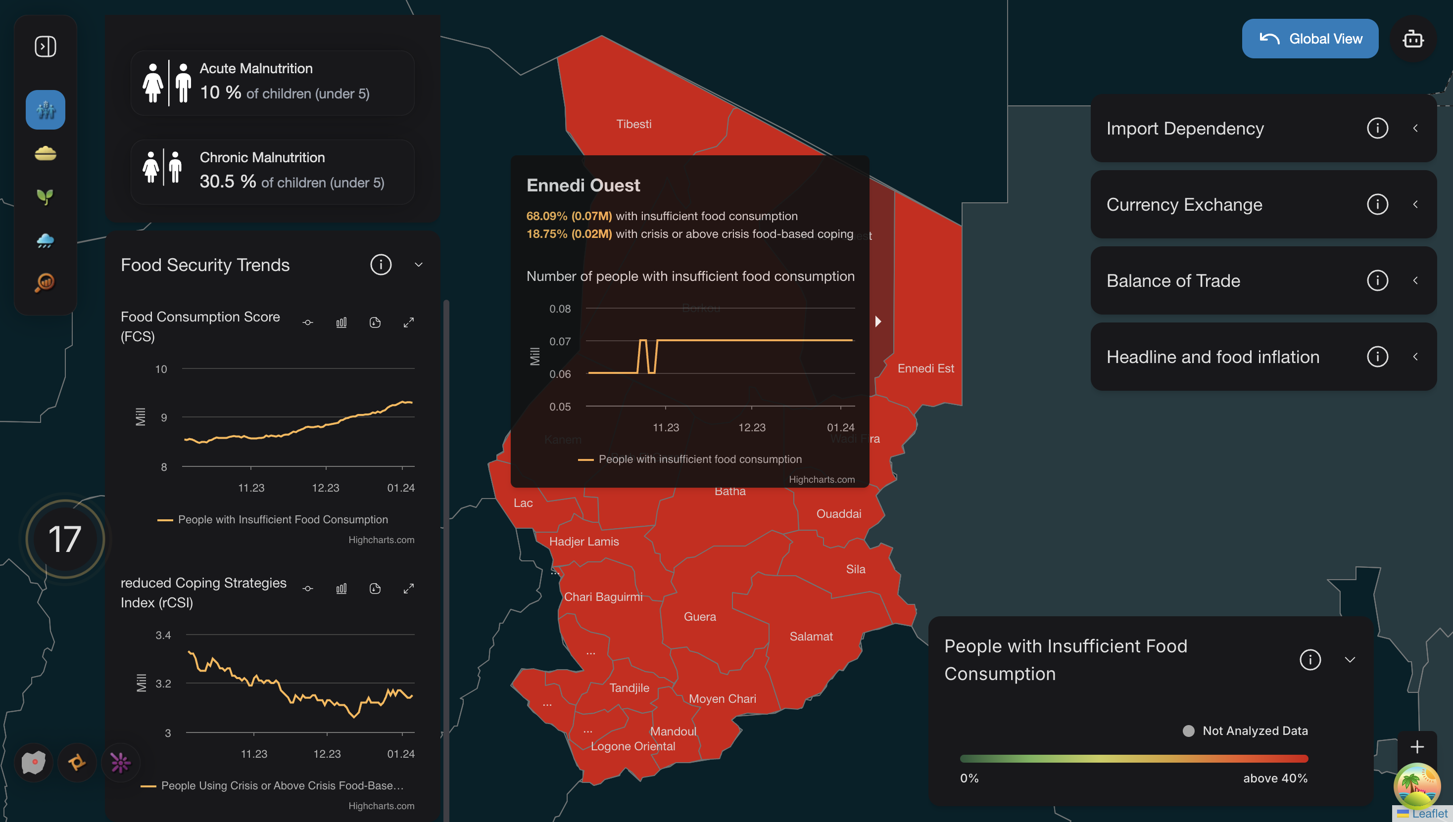
Gradient Legend will appear, which depicts the color with information People with insufficient food consumption.