Sidebar Component
Author: Georgi Tsipov
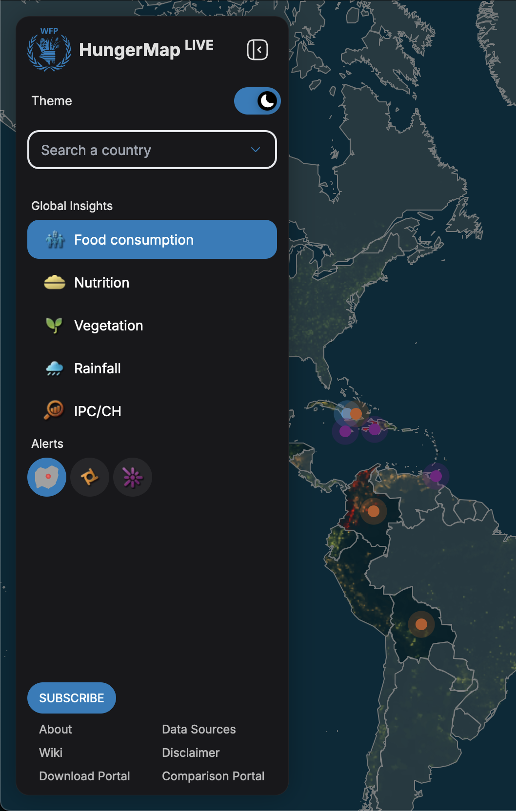
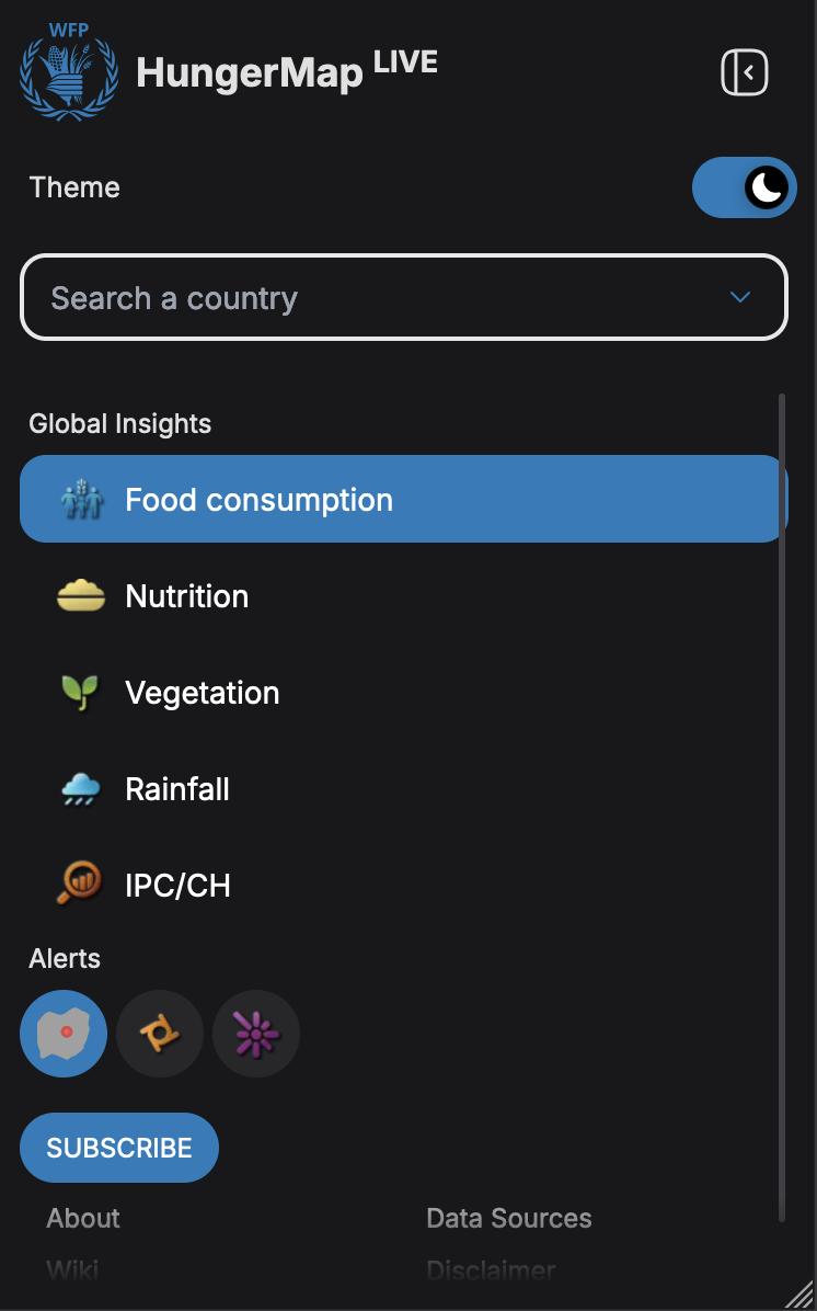
The Sidebar component provides a collapsible navigation and control panel, offering country search, global insights and alerts selection, and additional navigation options.
Features
- Collapsible
- Country search
- Global insights (map types) selection
- Alerts selection
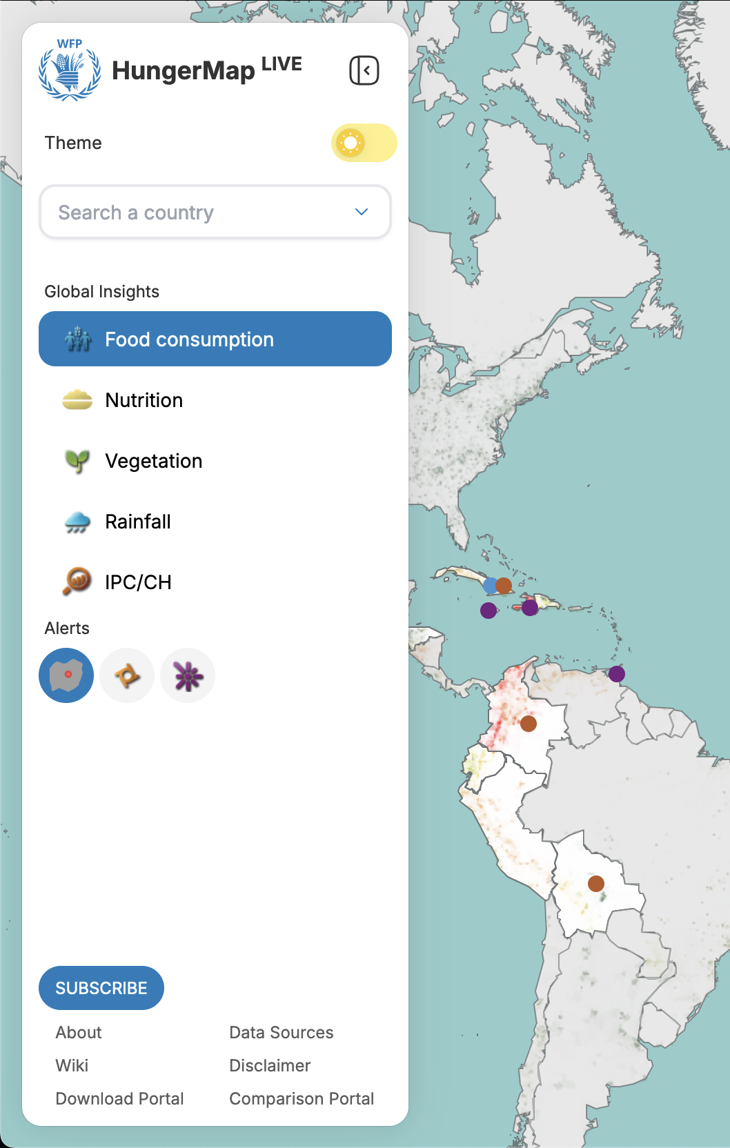
- Theme switching
- Newsletter subscription
- Quick navigation links
Component Structure
Header Section
- WFP Logo with text
- Sidebar collapse button
- Theme switcher
- Country search
Body Section
-
Global Insights Section (Map types)
- Food consumption
- Nutrition
- Vegetation
- Rainfall
- IPC/CH
-
Alerts Section
- Country alerts
- Hazards
- Conflicts
-
Footer Section
- Newsletter subscription button
- Navigation links grid (quick access to important pages)
Alerts Menu
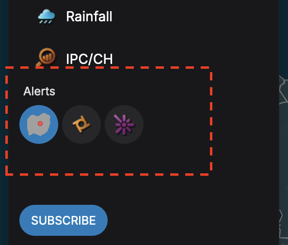
The AlertsMenu component serves as a flexible alert selection interface with support for nested alerts. Only one alert can be selected at a time. Per default the country alerts are selected. Clicking on an alert category with multiple alert subtypes will expand the nested alerts if there are any. Clicking again on a selected alert will deselect it.
Uses the SelectedAlertContext:
const { isAlertSelected, toggleAlert } = useSelectedAlert();
- Manages which alert type is currently selected
- Used to highlight the active alert button
- When an alert is selected
toggleAlert()updates the selected alert which is used by other components throughout the app
Key Features:
- Popover menus for nested alerts
- Tooltips for accessibility
- Loading indicators
Country Search
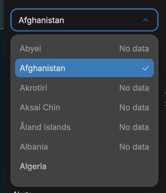
The component serves as the primary country selection interface, with built-in data validation and availability checks. Instead of manually searching and clicking on a country on the map, users can quickly find and select a country from the list. The map will automatically zoom to the selected country and display country-specific data.
Key Features:
- Alphabetically sorted country list
- Countries without data are disabled
- Integration with country selection context
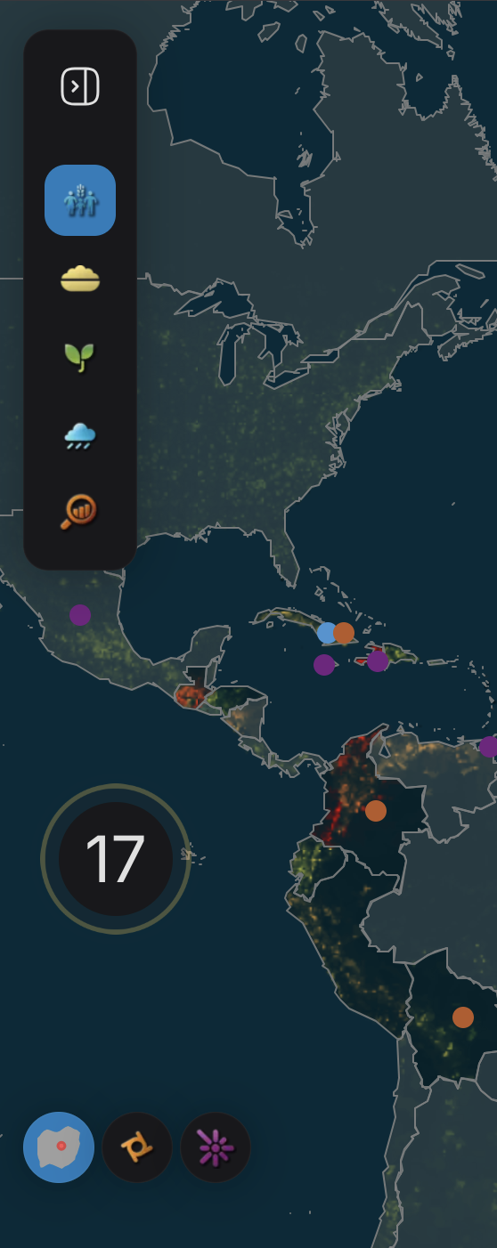
Collapsed Sidebar
Minimized version of the main sidebar. The CollapsedSidebar serves as a compact navigation interface, maintaining core functionality while maximizing screen space.
It contains the Global Insights (Map type) quick-access buttons with icons only to save space. Everything else is hidden. The alerts menu pops out of the sidebar and floats on the bottom left of the screen.
Navigaton
The sidebar contains a footer section with quick navigation links to important pages. The links are displayed in a grid layout for easy access. On these other pages, the sidebar is not visible and a top navigation bar is used instead.
Responsive Behavior
- Full screen width on mobile (
w-screen) - Fixed width of 280px on desktop (
sm:w-[280px]) - Automatic collapse on mobile after interaction
- Scrollable body on short screens
Contexts Integration
SidebarContext:
const { isSidebarOpen, toggleSidebar, closeSidebar } = useSidebar();
- Controls the sidebar's open/closed state
- When the sidebar toggle button is clicked:
toggleSidebar()is called - On mobile,
closeSidebar()is called to close the sidebar, when global insights or alerts are selected
SelectedMapContext:
const { selectedMapType, setSelectedMapType } = useSelectedMap();
- Manages which map type (Global Insight) is currently selected
- Used to highlight the active map button
- When a map type is selected
setSelectedMapType()updates the selected map which is used by other components throughout the app - Only one map type can be selected at a time
- Default map type is Food Consumption
SelectedCountryIdContext:
const { selectedCountryId, setSelectedCountryId } = useSelectedCountryId();
- Manages the currently selected country in the country search
- Controls the selected state of the country search
- When a country is selected:
setSelectedCountryId()updates the selected country
AccodionsModalContext:
const { clearAccordionModal } = useAccordionsModal();
- Used to clear any open accordion modals when switching map types
- Ensures clean state transitions between different views
Props
interface SidebarProps {
  countryMapData: CountryMapDataWrapper;
  fcsData: Record<string, CountryFcsData>;
}
- countryMapData - Contains geographical and metadata information for all countries. Powers the country search autocomplete and map rendering
- fcsData - Contains Food Consumption Score data for each country. Used to determine data availability for countries
The props interact with several data-fetching hooks:
useIpcQuery(): For IPC/CH datauseNutritionQuery(): For nutrition data
These combined with the props determine:
- Country search functionality
- Data availability indicators
- Map layer rendering
- Country selection validation
Usage
import { Sidebar } from "@/components/Sidebar/Sidebar";

<Sidebar countryMapData={countryData} fcsData={foodConsumptionData} />;