Tooltip
Author: Linus Sander
The Tooltip component renders a customizable tooltip. It is based on the NextUI Tooltip component.
It should be used as a wrapper for one or more components. When hovering over these wrapped components, the tooltip appears with a delay.
Parameters
childrenReact.ReactNode: the wrapped React componentstitlestring: title of the tooltip (optional)textstring: textual content of the tooltipdelaynumber: delay with which tooltip appears on hover in milliseconds; default is 0 (optional)warningboolean: selected if the tooltip should be highlighted; border of the tooltip is coloured in a warning color (optional)titleStylestring: additional tailwind classes to style the title (optional)textStylestring: additional tailwind classes to style the text (optional)offsetnumber: offset of the tooltip, default is set to 10 (optional)
Examples
Simple example
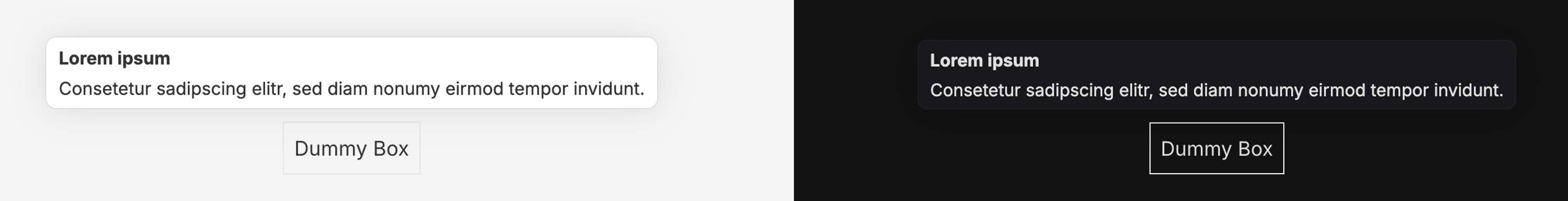
<Tooltip title="Lorem ipsum" text="Consetetur sadipscing elitr, sed diam nonumy eirmod tempor.">
    <div className="p-2 border-1"> Dummy Box </div>
</Tooltip>
Maxed out example
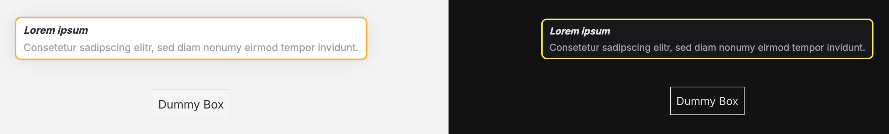
<Tooltip
    title="Lorem ipsum"
    text="Consetetur sadipscing elitr, sed diam nonumy eirmod tempor."
    delay={100}
    warning
    titleStyle="italic"
    textStyle="text-gray-400"
    offset={40}
>
    <div className="p-2 border-1"> Dummy Box</div>
</Tooltip>