Loading and Skeletons
Author: Lukas Fabio Weigmann
Overview
When the application is loading data, the corresponding components are showing a skeleton or loading animation. Here we will go over the most important loading functionality regarding the map.
Loading of application
When the map is loading the initial data containing information about the shapes of the countries and their borders, a skeleton
shaped like a world map is shown. Instead of the zoom control element also a skeleton is shown:
 In
In src/components/Map/MapLoader.tsx you can find the code for showing the skeleton component while loading the application and
once this is done the Map Component is shown.
The skeleton for the map is based on a SVG that is used in src/components/Map/MapSkeleton.tsx. Here both of the skeletons can be customized:
export default function MapSkeleton() {
  return (
    <div className="z-1 h-full w-full">
      <MapSkeletonData className="h-full w-full animate-opacityPulse fill-countriesBase bg-ocean" />
      <ZoomControlSkeleton />
    </div>
  );
}
The SVG is added additional behavior by using tailwind classes. animate-opacityPulse for example adds the behavior for changing the opacity of the element continuously and is defined in the tailwind config file.
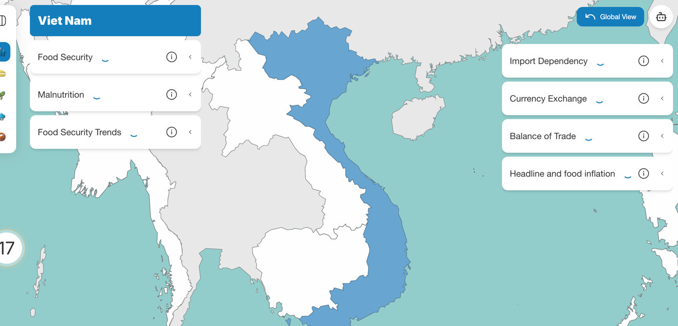
Loading after selection of country
When a country is selected, the map zooms to the corresponding country and is showing a skeleton in the shape of the country and
a loading animation for the accordions.
 The code for this behavior can be found in the Cloropleth Component of the currently selected mode in the
CountryLoadingLayer component:
The code for this behavior can be found in the Cloropleth Component of the currently selected mode in the
CountryLoadingLayer component:
function CountryLoadingLayer({ data, selectedCountryId, color }: CountryLoadingProps) {
  const filteredFeatures = data.features.filter((feature) => feature?.properties?.adm0_id === selectedCountryId);

  return (
    <GeoJSON
      data={{ type: 'FeatureCollection', features: filteredFeatures } as FeatureCollection<Geometry, GeoJsonProperties>}
      style={{
        color: 'undefined',
        fillOpacity: 0.3,
        fillColor: color,
        className: 'animate-opacityPulse',
      }}
    />
  );
}
Simply the data that is already passed to the cloropleth in order to be displayed in the global view is passed down to this component and shown with a different styling and behavior. Here the skeleton can again be customized (e.g. opacity, color etc.).